About the Company
Challenge
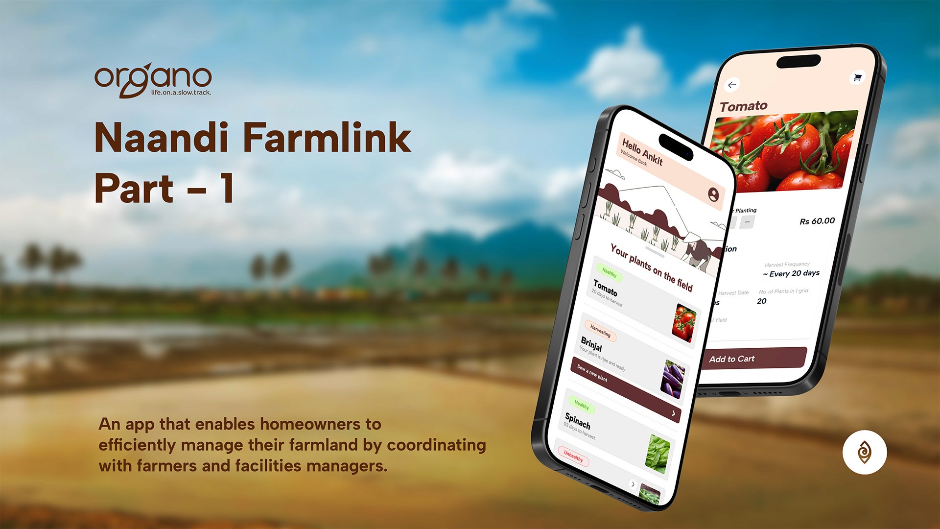
Organo Naandi offers each homeowner a private plot of land within the community. Since residents don't have time to cultivate their own crops, skilled farmers are available to manage the entire farming process on their behalf. This allows homeowners to choose and direct the cultivation of their desired crops while leaving the hands-on work to experienced professionals.
In the current state we observed the following issues.
01
Communication Gap: Too much time is wasted according to homeowners to communicated their preferences to the farmers
02
Lack of Produce and Profit Tracking: There is no place to showcase what is the amount of excess
produce there is and how much money did it make selling it.
We needed a solution
My Role
User Experience Designer. Responsible for all things related to design.
Conduct User research, Map current state of process that are being done physically, design the app. Coordinate with the farmers and farming coordinator to integrate the app.
Project Type
My Responsibilities
Category
Client
Project Goal
Improved Communication Efficiency:
Reduce the time homeowners and farmers spend communicating crop preferences and updates.
Crop Status Visibility:
Ensure visibility of crop growth stages and status for homeowners.
Produce Tracking and Profit Transparency:
Provide homeowners with accurate, real-time tracking of excess produce and related profits.
Impact
Overall Impact of the project among the various users.
The overall project reduced communication time between home owners to farmers from 3-4 weeks - Instant. From manually calling each family to getting an instant notification on the app.
100% adoption rate within the 75 families, 5 farmers, 4 Facilities management staff
Improved Error Reduction Rate.
Process Automation Impact: Time saved by facilities managers in terms of coordinating between farmers and home owners
Complete Transparency of the Plant Status - 30 status uploaded in 3 weeks.
Learnings
Key learnings I gained from implementing this project
Designing for Tier 3 Population of India: Designing for this demographic helped me understand their mindset, mental models, and challenges. Considering factors like low digital literacy and cultural contexts allowed me to address objections and pain points more effectively.
Conducting Research: Research helped me gain valuable insights into user behaviors and needs through interviews and observations, guiding my design decisions for better usability and adoption.
Mapping Processes: Mapping user processes allowed me to visualize the journey, identify potential pain points, and spot opportunities for design improvements to enhance clarity and efficiency.
Approach
Project Implementation Process
Looking for process & Data
Research
The research began by mapping the roles and responsibilities of key stakeholders, particularly farmers. I analyzed the tools and methods they use for successful farming. Desk research provided insights into farming practices, including crop cycles and common growth strategies.
Interviews with farmers, homeowners, and managers helped understand their needs and expectations, ensuring the app's design aligns with real-world user requirements
Interviews Included
05
Farmers
06
Home
Owners
03
Facilities Management
Staff
01
Farm store
Staff
Personas

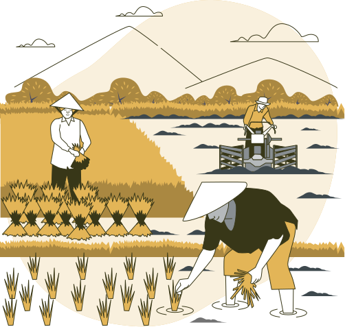
Farmers:
To grow and manage crops

Home Owners
Core Users of the app who want their farm to be managed

Farming Coordinator
A bridge between the home owner and farmer
Research Questions
Some of the questions asked that gave us most of our quantitative data are listed as follow
Q1
What is the current process followed to fulfil the service?
Q2
What are the existing tools used within the process?
Q3
Did you encounter any obstacles during this process?
Q4
How do users currently communicate with others involved in the process?
Q5
How comfortable are farmers with adopting mobile apps or other digital tools for managing tasks?
Q6
Key responsibilities and daily tasks of Users?
Insights
Results of the research
Mapping
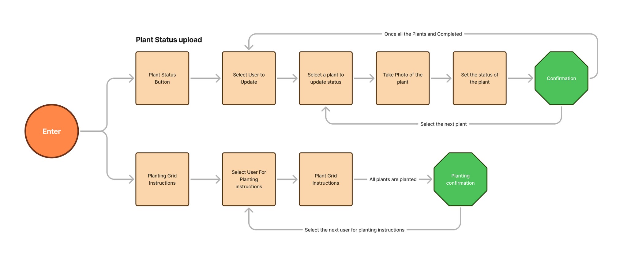
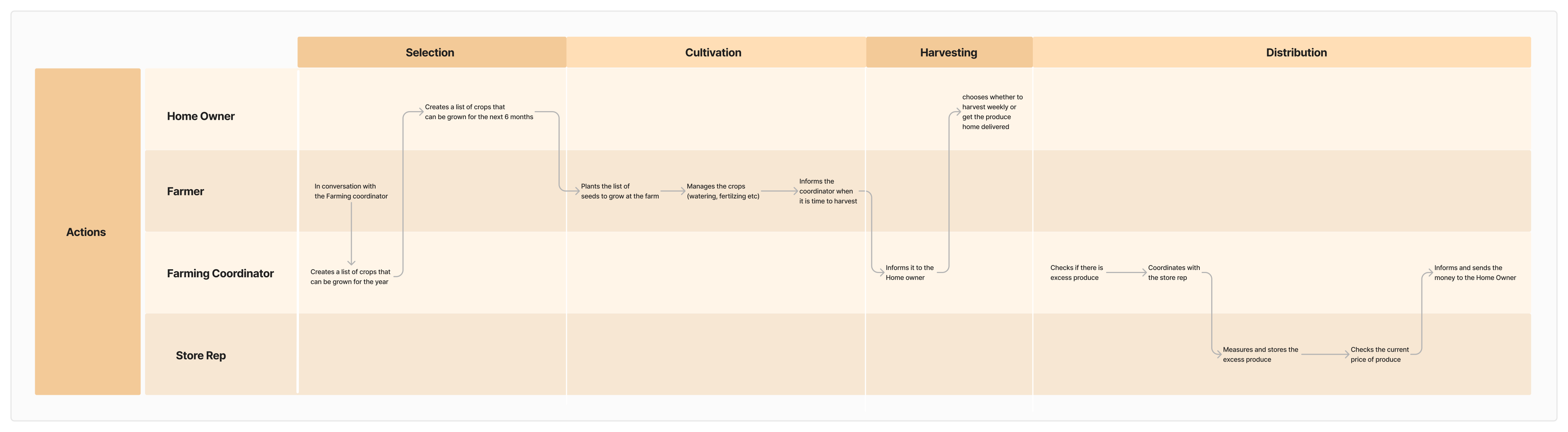
Through interviews and observational research, we mapped the entire process and identified key components to inform app design and deepen our understanding of users, including their roles and responsibilities.
Due to NDA restrictions, only a portion of the maps and processes are displayed below.


Note
To keep the information clear and manageable, this case study is divided into two parts. This part focuses specifically on the "farmer", in the app design process.
A few Insights we got from Farmer interview
Visual-Centric Design
Farmers prefer designs that rely on visuals rather than text. This makes information easier to understand, especially for those with limited literacy in the app's primary language.
Image-Centric Communication
Icons and words, unless displayed in their native language, can be confusing for farmers. They find image-based interfaces more intuitive for navigation and comprehension.
Simplified User Flow
Complex interactions on a single page can overwhelm farmers. A simple, step-by-step approach with clear actions is essential for ensuring usability.
Recognition Over Recall
Farmers struggle to remember previous interactions with the app. Features that provide context or visual reminders of past actions can reduce cognitive load and enhance usability.
Person-Led Onboarding
Farmers find in-person onboarding sessions more effective than app-based tutorials. Tutorials such as videos or contextual tooltips are less impactful without human guidance.
Farmer Persona
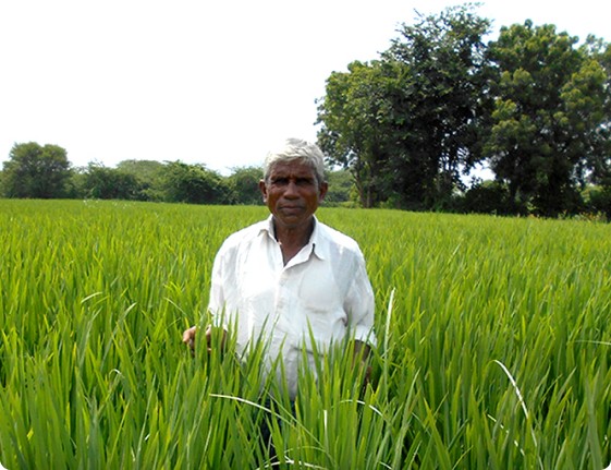
Responsible for cultivating and maintaining farmland within the community. Coordinates with facilities managers and residents for crop selection and updates.
Goals
Maintain healthy and productive farmland to meet community expectations.
Provide timely updates on crop health and yield.
Use sustainable practices while balancing requests from residents.
Challenges
Communication: Difficulty understanding technical jargon or app interfaces not available in the local language.
Tech Access: Limited familiarity with mobile apps or software, relies on simple and intuitive designs.
Resource Constraints: Dependence on facilities managers for resources like seeds, fertilizers, and equipment.
Time Management: Balancing multiple requests from homeowners while focusing on the farm's needs.
Prototype Development
How insights became design decisions that would help farmers complete their tasks.
01
Recognition over Recall
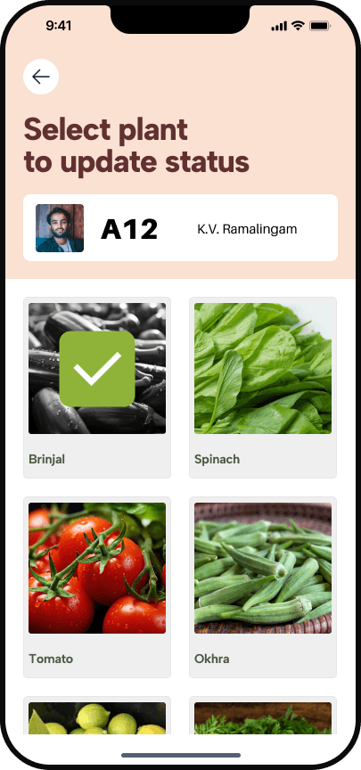
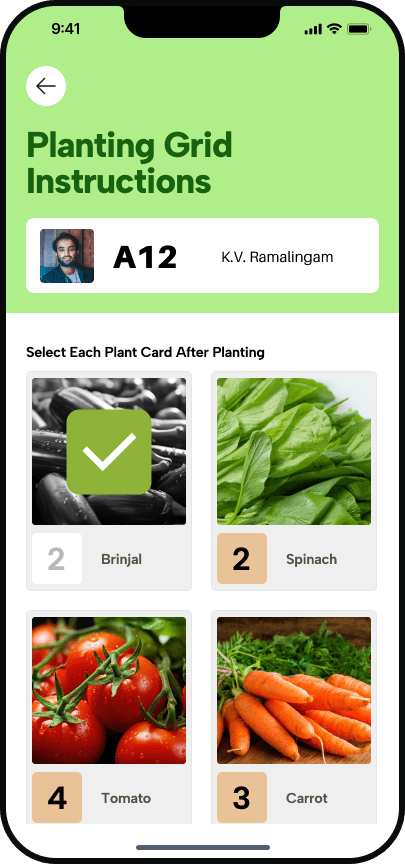
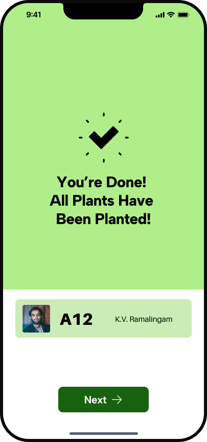
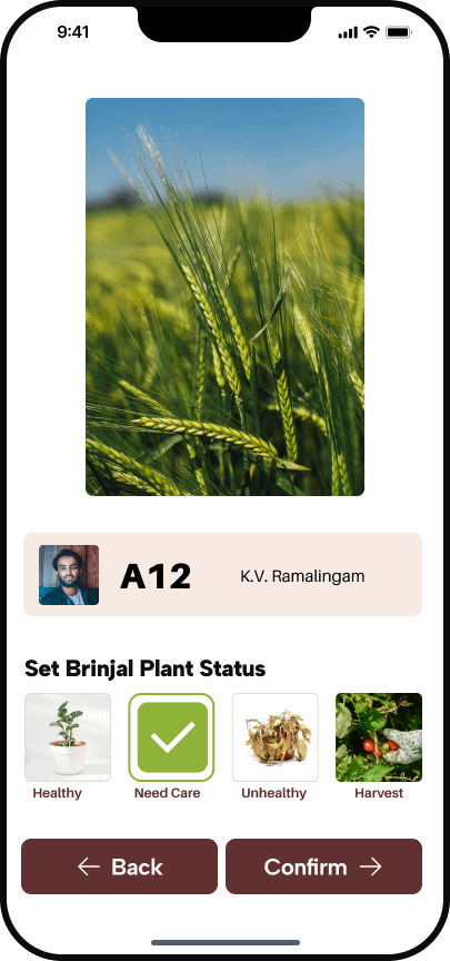
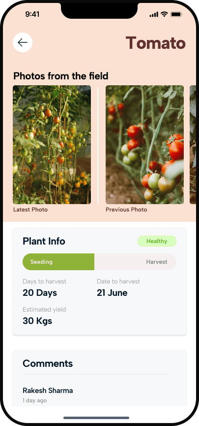
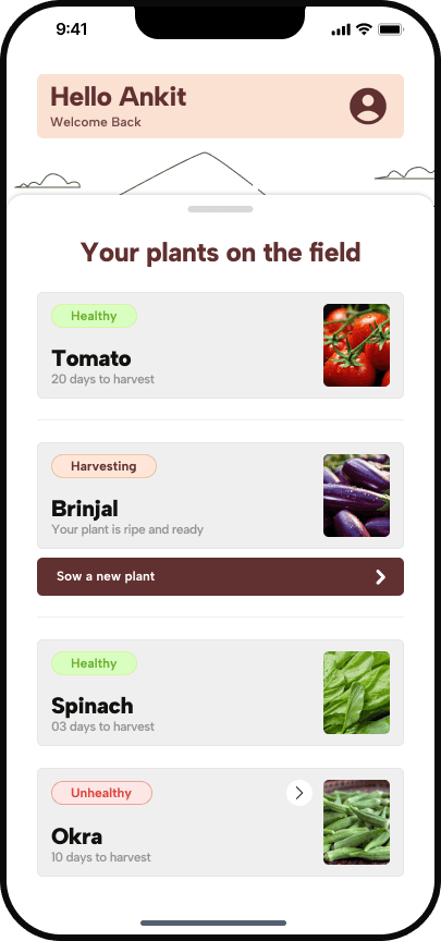
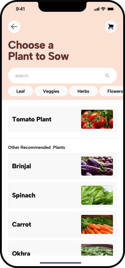
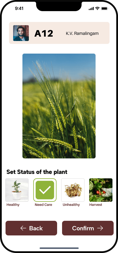
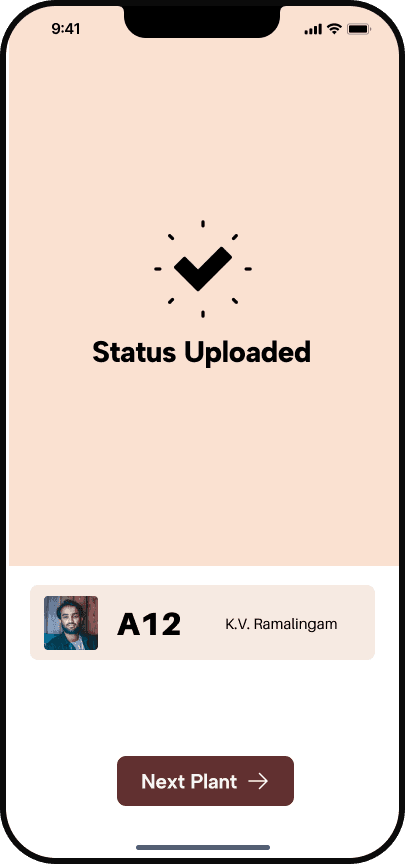
There are recognition elements across screens so farmers are not confused. Like in the image to the left we have the card of the home owner

02
Images over icons
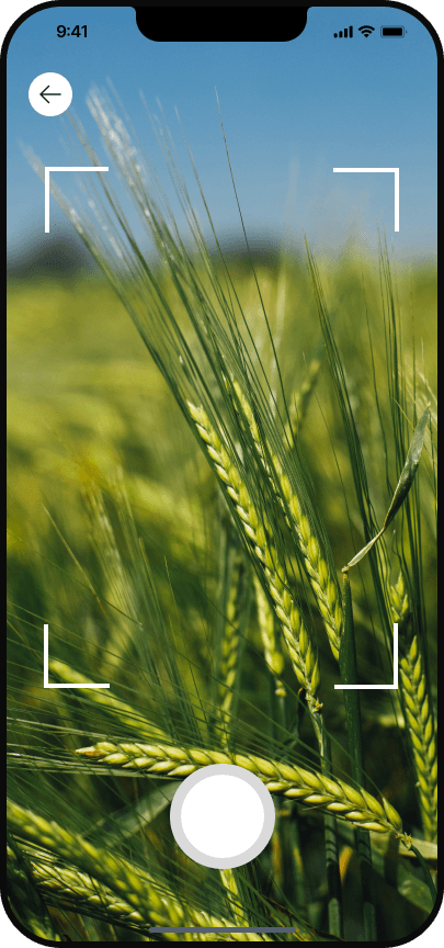
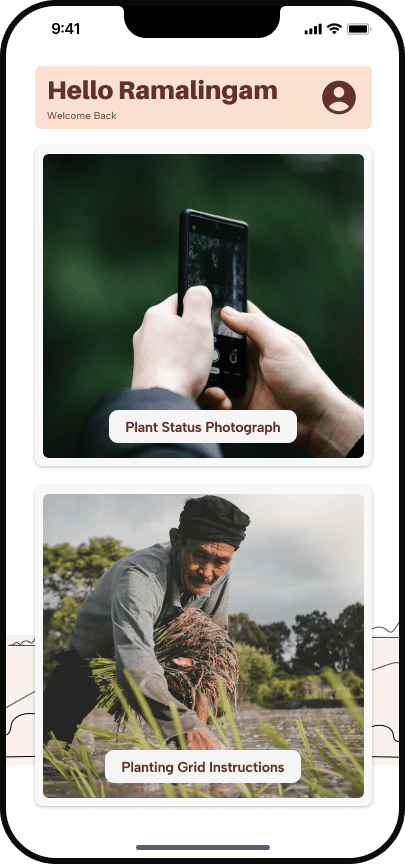
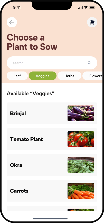
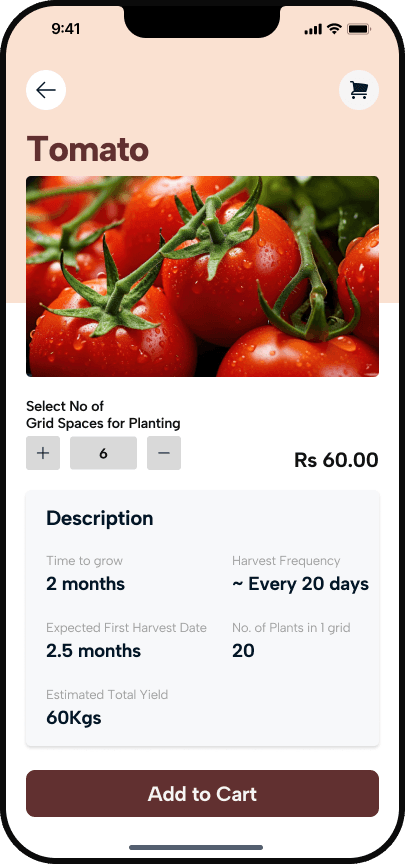
Each feature is accompanied by an image. Like the card of the plant has the relevant plant ( See left), home owner's photo etc.

03
Unified Icon
A single tick icon is consistently used for confirmation throughout the design, ensuring farmers only need to recognize one icon.

04
Linear User Flow
The design features a straightforward, minimal-branching flow to keep farmers focused and reduce confusion.
To further differentiate the two flows, color coding is used:
Green-themed screens for the Planting Grid Instruction Flow
Brown-themed screens for the Planting Status.